
The 60-Second Color Match: A Simple System for Ties, Shirts, and Jackets
Stop guessing at the mirror. This practical color-matching method helps you build sharper outfits from the clothes you already own, whether you are dressing for work, a wedding, or a night out.

.tys-ce-article h2{font-family:Georgia,Times New Roman,serif;font-size:clamp(27px,3vw,38px);line-height:1.2;margin:44px 0 16px;color:#111}.tys-ce-article h3{font-size:22px;line-height:1.3;margin:28px 0 10px;color:#181818}.tys-ce-article p{margin:0 0 19px}.tys-ce-article ul,.tys-ce-article ol{margin:0 0 24px;padding-left:26px}.tys-ce-article li{margin:8px 0}.tys-ce-article blockquote{margin:30px 0;padding:20px 24px;border-left:4px solid #c7a45a;background:#f7f4ec;border-radius:0 14px 14px 0;font-family:Georgia,Times New Roman,serif;font-size:20px}.tys-ce-article a{color:#7a5b1d;text-decoration-thickness:1px;text-underline-offset:3px}
Color matching does not need to become a study in paint charts. Most sharp outfits rely on three things: one calm base, one clear point of contrast, and a little coordination between the details. The trick is knowing which color should do the talking.
Use this quick system when you are standing in front of the closet with one minute to spare. It works for ties, shirts, jackets, and the small accessories that finish the outfit without shouting over it.
1. Start with the quietest piece
Choose the item that covers the most visual space first. Usually, that is your suit or jacket. If it is navy, charcoal, gray, tan, or another neutral, you have already made life easier. Neutrals are not boring; they are dependable teammates.
Next, add your shirt. A white shirt gives you the widest range of options. Light blue is nearly as useful and brings a little more color without becoming demanding. Pale pink, cream, and soft lavender can also work well, but treat them as colors rather than blank canvases.
Only after those two pieces are settled should you choose the tie or pocket detail. This prevents the common mistake of falling in love with a tie first and then trying to force the entire outfit to apologize for it.
2. Use the contrast check
Ask one simple question: Can I clearly see where one piece ends and the next begins? If the answer is no, the outfit may look flat. If every item is competing for attention, it may look busy.
Low contrast
Low-contrast combinations sit close together in lightness or color. Think a light blue shirt with a muted blue tie, or a cream shirt with a tan jacket. These combinations look relaxed and refined. They are especially useful for daytime events, warm weather, and less formal offices.
Medium contrast
Medium contrast is the everyday sweet spot. A white shirt with a burgundy, forest green, or medium-blue tie gives the outfit definition while keeping it easy to wear. This is a good place to begin if you want to look intentional without looking as if you spent an hour planning your lapel.
High contrast
High contrast creates a stronger, more formal effect: a white shirt with a dark navy or charcoal tie, for example. It can look excellent for presentations, evening events, and ceremonies. Keep the rest of the outfit simple so the contrast feels clean rather than theatrical.
3. Match the mood, not every color
Colors do not have to be identical to work together. They simply need to share a visual mood. A rich burgundy tie and a deep navy jacket are different colors, but both feel substantial and polished. A soft blue shirt and a muted green accessory feel lighter and more relaxed.
A useful rule is to coordinate temperature and intensity more than exact hue.
- Temperature: Warm colors such as rust, tan, mustard, and burgundy tend to sit comfortably together. Cool colors such as blue, gray, and blue-green often create a calm combination.
- Intensity: Bright colors pair more easily with quiet neutrals than with several other bright colors. If one piece is vivid, let the rest of the outfit lower its voice.
- Depth: Darker colors look grounded with other deep shades or crisp light neutrals. Several middle-tone colors can sometimes blur together.
This is why a lively patterned tie can work beautifully with a plain shirt and understated jacket. The pattern brings energy; the surrounding colors give it somewhere to land.
4. Let patterns have one clear job
When color matching goes wrong, the culprit is often not the colors themselves. It is too many patterns doing too much at once.
If your shirt is patterned, choose a tie with a larger, simpler pattern or a solid color pulled from the shirt. If your tie is the statement piece, keep the shirt quiet. A patterned jacket, patterned shirt, and patterned tie can work for an experienced dresser, but it is not the ideal experiment five minutes before leaving the house.
Pay attention to scale, too. Small checks can sit comfortably with a broader stripe. Two tiny, busy patterns may vibrate visually, while two large patterns can make the outfit feel crowded. Different scales create separation.
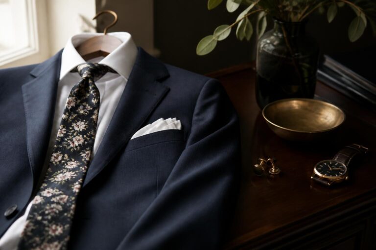
For a festive occasion, the Marti Gras tie brings a lively spirit in 100% cotton. Because the tie is designed to make an impression, pair it with a solid, quieter shirt and jacket rather than adding another loud pattern. The goal is a focal point, not a committee meeting.
5. Use the jacket as your anchor
Your jacket is usually the visual frame around the shirt and tie, so use it to judge the final combination. Navy is flexible with white, light blue, pink, burgundy, green, and many warm neutrals. Gray works with nearly all of those, though the shade matters: charcoal creates a more formal look, while lighter gray feels easier and more casual.
Brown and tan jackets bring warmth. They tend to pair naturally with cream, pale blue, olive, rust, burgundy, and other softened colors. If the jacket is already warm and textured, a smooth, straightforward tie often looks more balanced than another rustic or heavily patterned piece.
Black deserves a little restraint. A white shirt and a dark tie create a crisp, formal combination, while adding several strong colors can make the outfit feel less considered. When in doubt, keep black’s supporting cast simple.
6. Finish with small accessories
Accessories should connect with the outfit, not duplicate it. A pocket square can repeat a color from the tie without copying its pattern. Shoes and belt usually work best in the same general family, though they do not need to be an exact leather match.
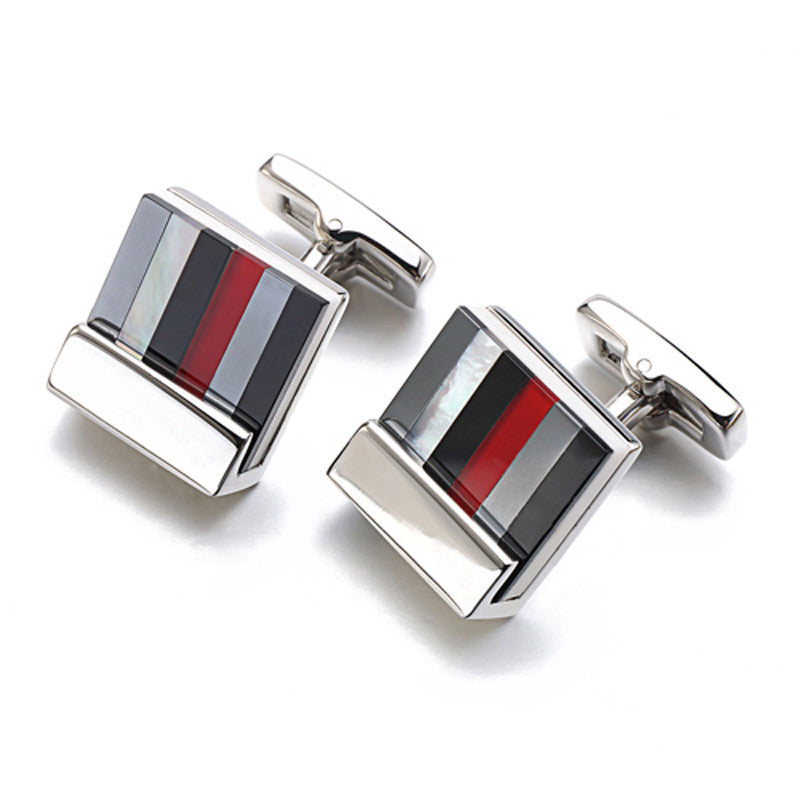
Cufflinks are an opportunity for a quiet detail. The Bookshelf Cufflinks use glass enamel plating in a French-style design, making them a subtle statement when the main outfit is already doing enough. With distinctive cufflinks, keep the tie and pocket square coordinated but uncomplicated.
Think of accessories as punctuation. One exclamation point is stylish. Four starts to look like a very enthusiastic email.
A quick mirror checklist
- Find the base: Identify the jacket and shirt colors before choosing accessories.
- Pick the lead: Decide whether the tie, shirt, or jacket is the main visual feature.
- Check contrast: Make sure the pieces do not disappear into one another.
- Control the patterns: Keep one pattern prominent and let the others support it.
- Repeat one color lightly: Echo a shade in the tie, pocket square, socks, or cuff detail, but do not clone the entire outfit.
- Remove one thing: If the outfit feels busy, take away the loudest extra before changing everything.
The best color combinations look planned, not programmed. Leave a little room for texture, occasion, and personal taste.
Once you start with a quiet base, judge contrast, and match the mood rather than chasing exact color pairs, dressing becomes much faster. You are not trying to make every piece agree word for word. You are giving each one a sensible role in the conversation.