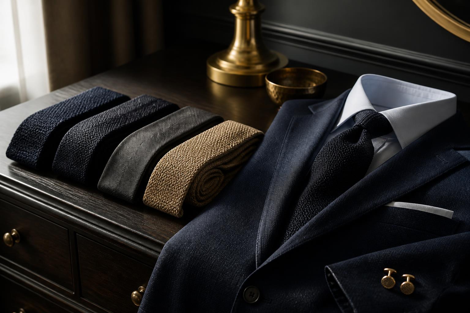
How to Choose a Tie by Texture, Not Just Color
Color gets most of the attention, but texture often decides whether a tie looks right. Use this practical guide to match ties with shirts, jackets, and occasions without overthinking your outfit.

.tys-ce-article h2{font-family:Georgia,Times New Roman,serif;font-size:clamp(27px,3vw,38px);line-height:1.2;margin:44px 0 16px;color:#111}.tys-ce-article h3{font-size:22px;line-height:1.3;margin:28px 0 10px;color:#181818}.tys-ce-article p{margin:0 0 19px}.tys-ce-article ul,.tys-ce-article ol{margin:0 0 24px;padding-left:26px}.tys-ce-article li{margin:8px 0}.tys-ce-article blockquote{margin:30px 0;padding:20px 24px;border-left:4px solid #c7a45a;background:#f7f4ec;border-radius:0 14px 14px 0;font-family:Georgia,Times New Roman,serif;font-size:20px}.tys-ce-article a{color:#7a5b1d;text-decoration-thickness:1px;text-underline-offset:3px}
When a tie feels almost right but not quite, color is not always the problem. Often, the missing piece is texture. A smooth, shiny tie can look too formal with a relaxed jacket, while a heavily textured tie may feel out of place with a crisp business suit.
The good news: you do not need a closet full of complicated rules. Learn to read the surface of a tie, compare it with the rest of your outfit, and you can make better choices in a few seconds. Here is a simple way to do it.
1. Start by identifying the outfit’s overall texture
Before choosing a tie, look at your shirt and jacket together. Ask whether the outfit feels smooth, textured, or somewhere in between.
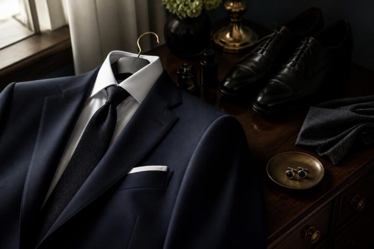
- Smooth: A broadcloth shirt, worsted suit, and polished dress shoes create a clean, refined surface.
- Textured: Oxford cloth, flannel, tweed, linen, corduroy, and brushed wool all bring visible depth.
- Mixed: A crisp shirt with a softly textured jacket, or a knit polo under a tailored blazer, sits between the two.
Your tie should usually relate to that texture rather than fight it. Smooth outfits welcome ties with a clean finish. Textured outfits tend to look more natural with ties that have some visual or physical depth.
This does not mean everything should match like a furniture showroom. Contrast is useful. The goal is balance: enough difference to keep the outfit interesting, but not so much that one piece appears to have arrived from a different dress code.
2. Match the tie’s surface to the level of formality
Texture is a quiet way to control formality. You can keep the same shirt and jacket but change the tie, and the outfit can move from boardroom-ready to relaxed dinner attire.
For polished, formal settings
Choose a tie with a relatively smooth surface and a controlled pattern. It will sit comfortably beside a dark suit, a fine dress shirt, and polished shoes. Subtle stripes, small dots, and restrained solids tend to work well because they add interest without making the outfit feel casual.
For business-casual settings
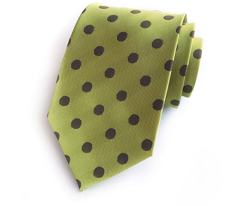
A little texture can make tailoring feel less rigid. Look for a tie with a matte appearance, visible weave, or a pattern that is easy to read from a short distance. This is where a small polka-dot design can be especially useful: the pattern has personality, but it remains orderly. The Spot-On Tie Collection is one option for adding that kind of controlled detail.
For relaxed social occasions
You can be more expressive with texture and pattern, particularly when the jacket is casual or the setting is outdoors. A cotton tie with a lively print can work well with an unstructured blazer or a simple button-down. The American Blossom, for example, brings a floral direction and a cotton construction to the outfit without requiring a complicated color scheme.
3. Use contrast carefully
A reliable outfit usually has a mix of visual weights. If your jacket is strongly textured, a very busy tie can make the chest area look crowded. If the jacket and shirt are both plain and smooth, a tie with a noticeable weave or pattern can give the outfit some needed character.
Try this three-part check:
- Compare the shirt and tie. A textured tie often stands out best against a relatively smooth shirt. If both have bold texture, make sure their colors are calm.
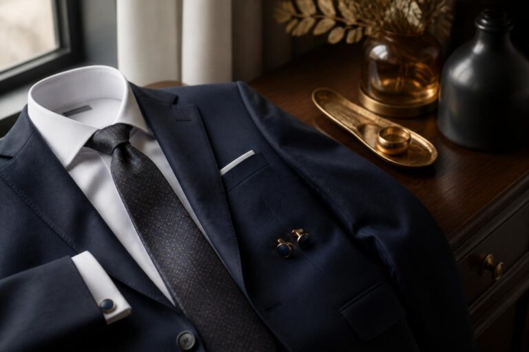
- Compare the tie and jacket. A smooth tie can sharpen a tweed or flannel jacket. A textured tie can soften a sleek suit.
- Step back. Look at the outfit from several feet away. If the tie is the only thing you notice, the pattern or texture may be doing too much.
A useful rule: one piece can be the conversation starter. The other pieces should know how to listen.
4. Let pattern scale do some of the work
Texture and pattern are closely related, but they are not the same thing. A tie can have a subtle texture and a bold pattern, or a smooth surface and a very quiet pattern. Consider both before you decide.
Small patterns generally look neat and versatile. They are easy to wear with patterned shirts because the elements do not compete as quickly. Larger patterns need more room, so pair them with simpler shirts and jackets.
If your shirt has a visible stripe or check, choose a tie whose pattern is clearly different in scale. A small-check shirt with a larger, spaced-out pattern can create separation. A tiny check with tiny dots, on the other hand, may blur together from a normal viewing distance.
For a first test, place the tie on the shirt without putting it on. If the pattern edges disappear into the shirt, try a different scale or a more distinct texture.
5. Build a practical texture rotation
You do not need every type of tie. A small rotation can cover most situations if each tie has a different job.
- One smooth, restrained tie: Keep this for formal meetings, ceremonies, and occasions where a crisp finish makes sense.
- One lightly textured or small-pattern tie: Use it for regular office days, presentations, dinners, and outfits that need polish without stiffness.
- One expressive tie: A floral, geometric, or otherwise distinctive design gives simple jackets and shirts a point of view.
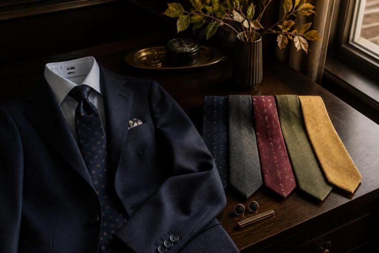
When adding a new tie, ask what role it fills. If you already own three smooth navy options, another nearly identical tie may be less useful than one with a different surface or pattern scale. Variety should make dressing easier, not turn your drawer into a fabric census.
Common texture mistakes to avoid
- Making every piece shiny: A glossy shirt, shiny tie, and polished suit can look overly formal and a little dated. Let one element have the shine.
- Ignoring the jacket: The tie may look fine against the shirt but clash with a rough tweed or casual cotton jacket. Always judge the full upper half of the outfit.
- Confusing boldness with texture: A loud color is not automatically a textured choice. If the tie is visually strong, keep the surrounding pieces calmer.
- Using texture as a substitute for fit: No weave can rescue a collar that collapses or a jacket that pulls at the buttons. Check the basics first.
A quick morning checklist
- Identify whether your shirt and jacket are smooth, textured, or mixed.
- Choose a tie that either supports that texture or provides controlled contrast.
- Check pattern scale against the shirt.
- Look at the full outfit from a distance.
- Make sure the tie suits the setting before adding personality.
If you want more guidance once the tie is selected, Ty’s guide to wearing a tie well covers the finishing details that keep the result neat.
Color still matters, of course. But texture is the overlooked shortcut. Once you notice how smooth, matte, coarse, or lively each piece looks, choosing a tie becomes less about guessing and more about giving the outfit the right amount of structure.